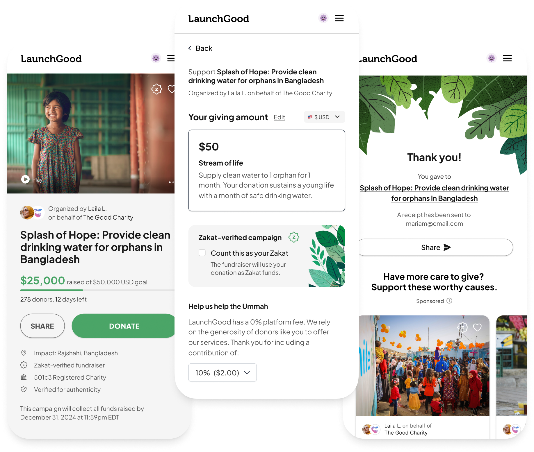
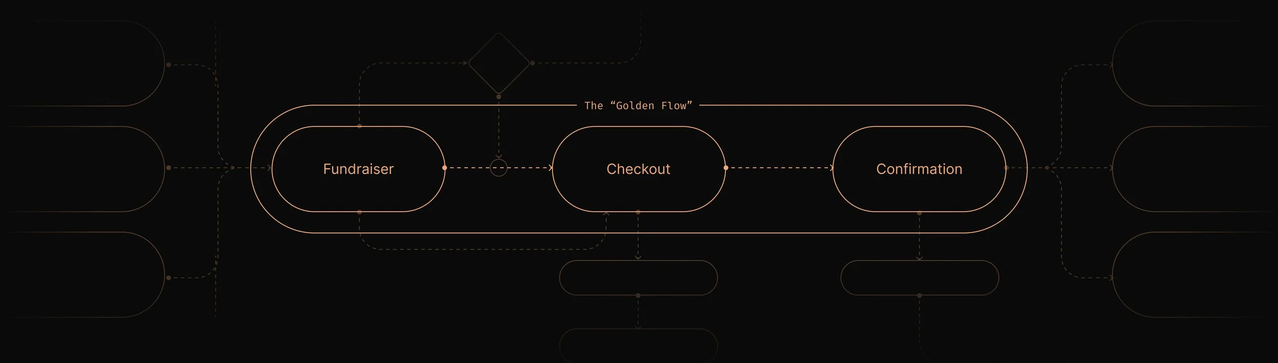
LaunchGood is a crowdfunding platform with a niche, Muslim, customer base. The “Golden Flow” represents the most critical point in a donor’s journey on LaunchGood. It consists of the fundraising page, the checkout, and the confirmation.
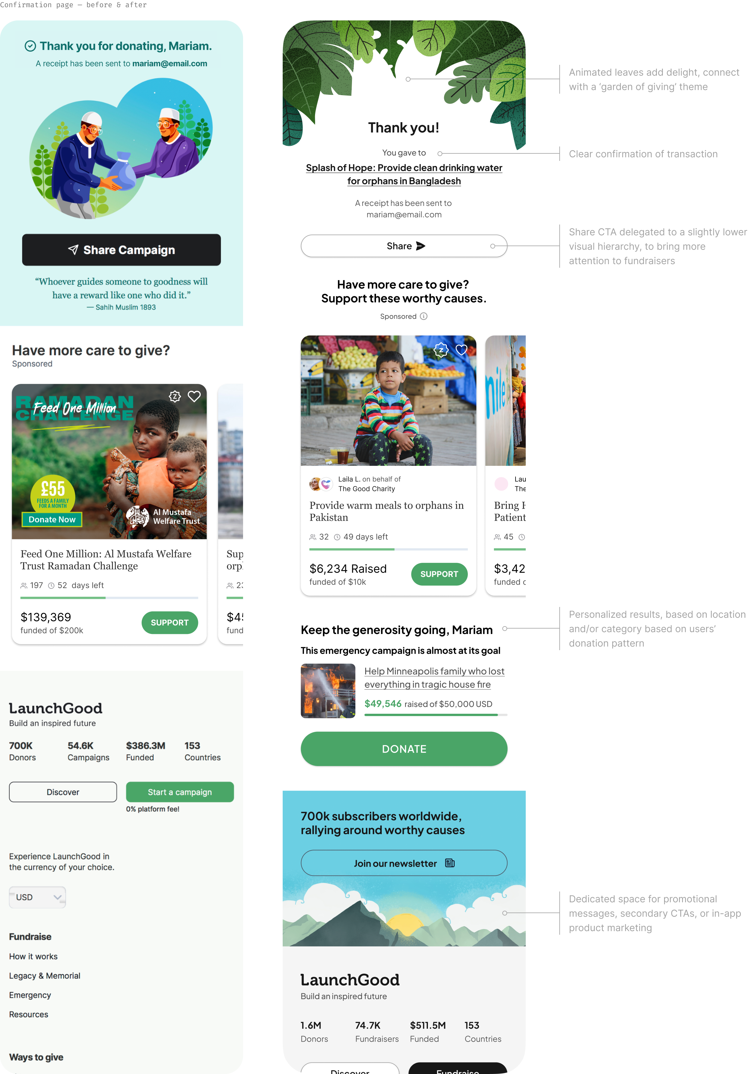
The fundraising page was last updated in 2020. The confirmation page receives regular updates as it’s a low-risk, high-reward touchpoint, encouraging donors to continue their journey on LaunchGood.
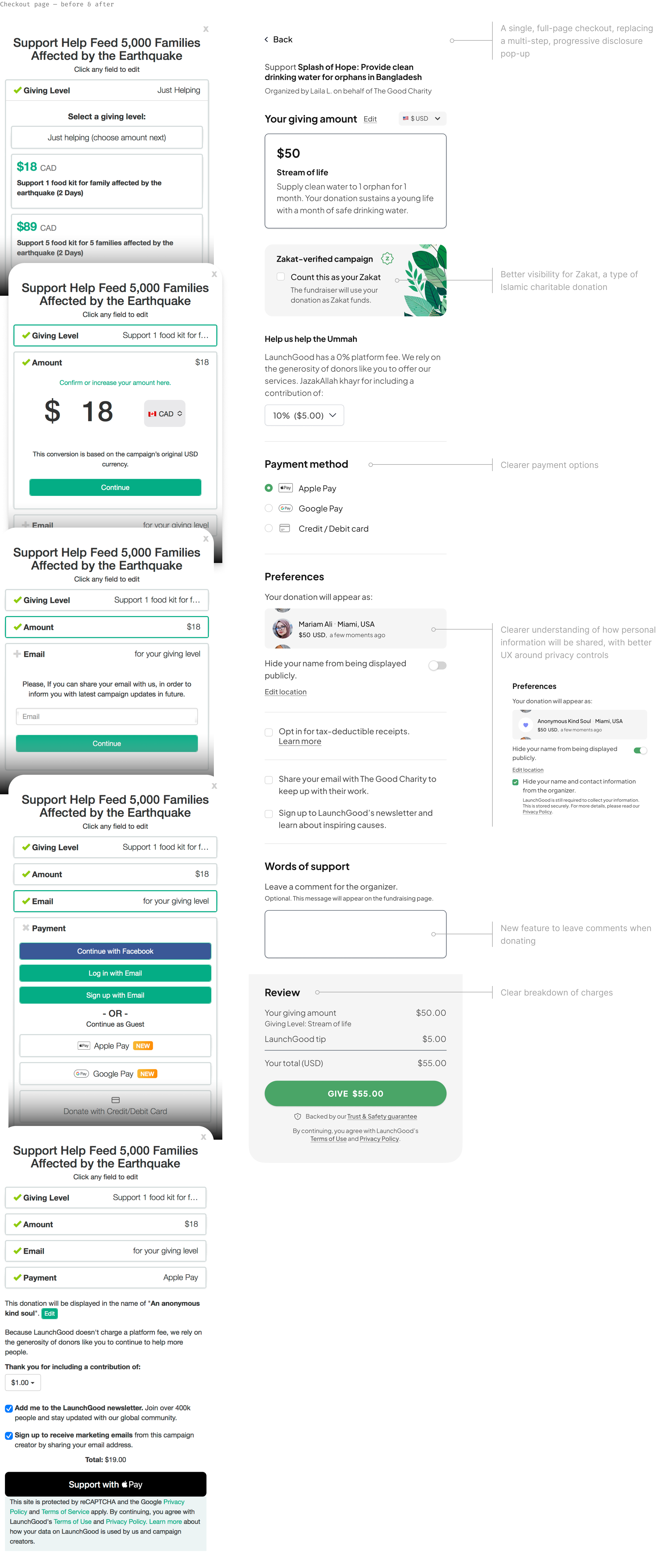
The checkout page — the core of the Golden Flow and the key conversion point — had not been updated for several years. It became outdated, disconnected from the platform’s visual language, and clunky due to evolving industry trends and user expectations.
~2x conversion
19.1% compared to 10.8%
highlights
$200,000
additional revenue (USD), when launched in Ramadan
Umar Shahzad, Designer
Mariam E, Product Manager
Muhammad J, Engineer
Rafill H, Engineer
Team
In late 2023, in a conversation with the CPO and CDO, I recommended separating the technical rebuild from the UX/UI redesign, so that the frontend customer experience would not become further disjointed in the process. This lead to a few follow up conversations including the CEO and Head of Engineering to help them understand what a redesign would involve. I chose the Golden Flow to help demonstrate this, since it wasn’t on our Roadmap, and would not derail any team’s ongoing work.
We debated with trust, and then committed not only to continue with the visual redesign, but also to add the Golden Flow to our Product Roadmap, for delivery in Ramadan 2024 (April – May 2024).
The decision to revamp the Golden Flow came about serendipitously and was not initially on our Product Roadmap for the year.
LaunchGood has been undergoing a major technical rebuild to support the organization as it continues to grow and scale. At the same time, the Design team is also revamping the overall user experience and introducing a new visual design language.
Background
initial problem statement
Bridge the gap in understanding of a platform-wide visual redesign with the Leadership team, and discuss the pros & cons of separating it from the technical rebuild.
Objectives
subsequent problem statement
64% of users (all-time) have donated on LaunchGood only once. 74% of users donate via guest checkout. How might we rethink the donor experience so that first time guest users can become repeat donors?
Research
Many sources were used to inform the design of the Golden Flow:
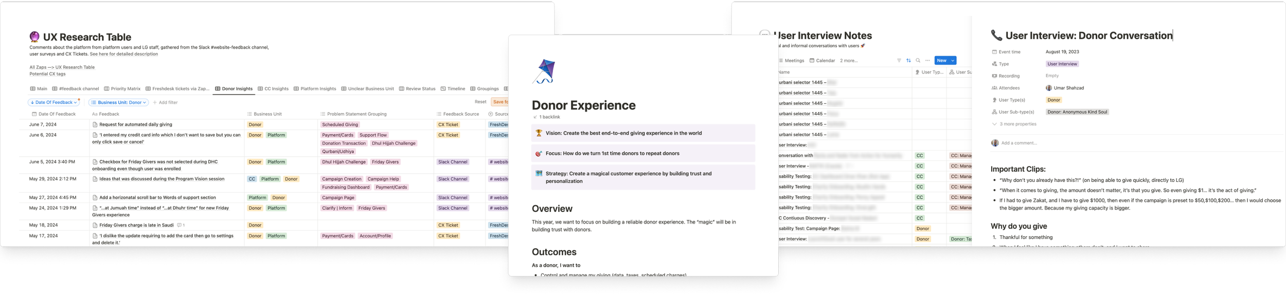
A database of customer and internal feedback. Maintained by our UX Researcher, this database provides foundational insights about pain points and opportunities.
Existing PRDs and research. Donor retention, and overall donor experience was already part of our objectives for the year, so we were able to leverage prior research and data into the project.
Discovery calls. At the start (when it was still a solo project for the Leadership team), I had discovery calls with several people to understand, from a first principles perspective, why and how they donate.
Low fidelity sketching brought ideas on to (digital) paper, and made abstract concepts more tangible for stakeholder discussion.
To test a gamification element on the confirmation page, Midjourney was used to generate concept art. Not only did this expedite testing, but it also saved time and cost when the idea was confusing for testers, and we had to pivot.
High fidelity, interactive prototypes were created in Figma to test various other interactions, and to get stakeholder input.
Within our Pod, we also had regular group brainstorming and ideation sessions.
Ideation
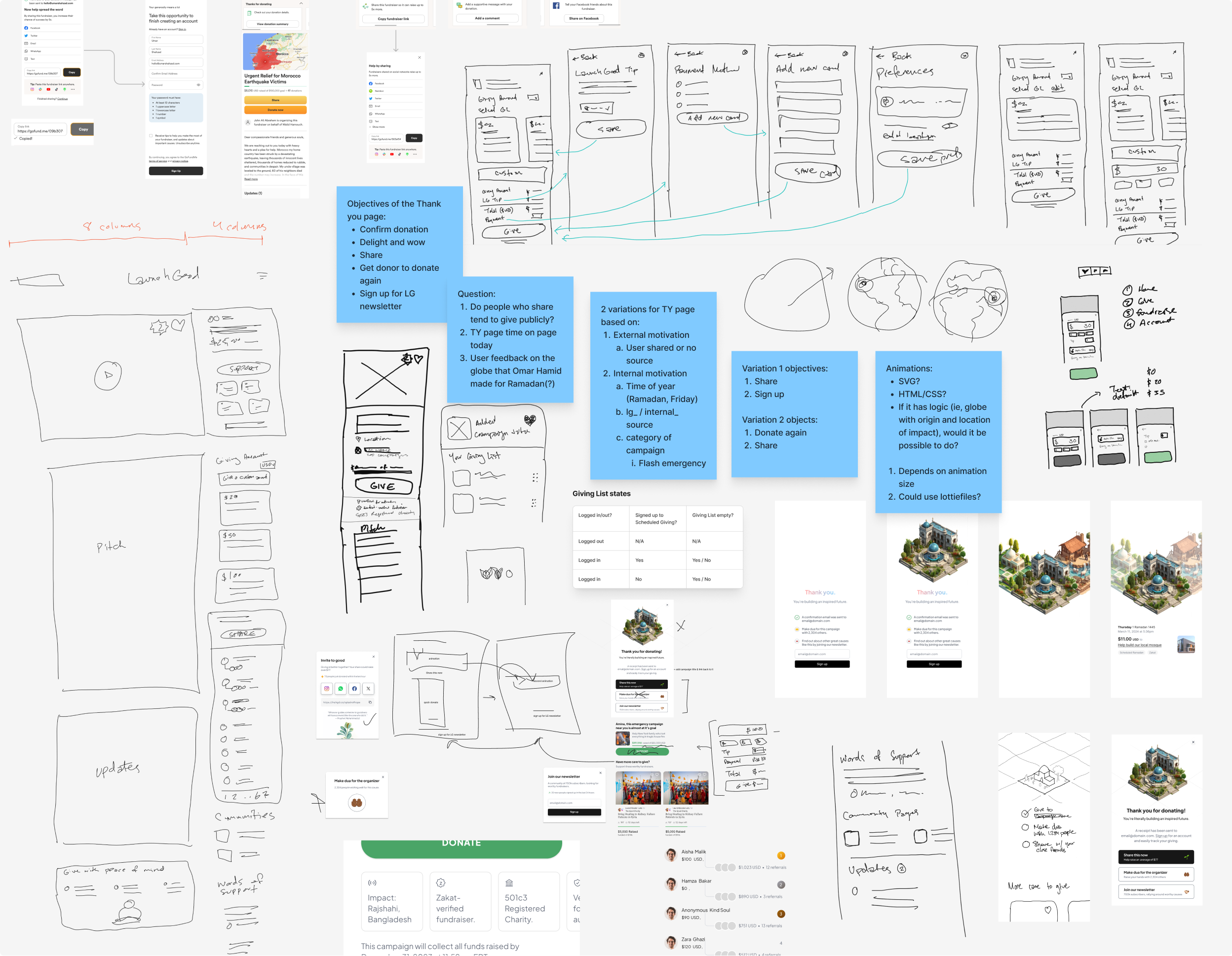
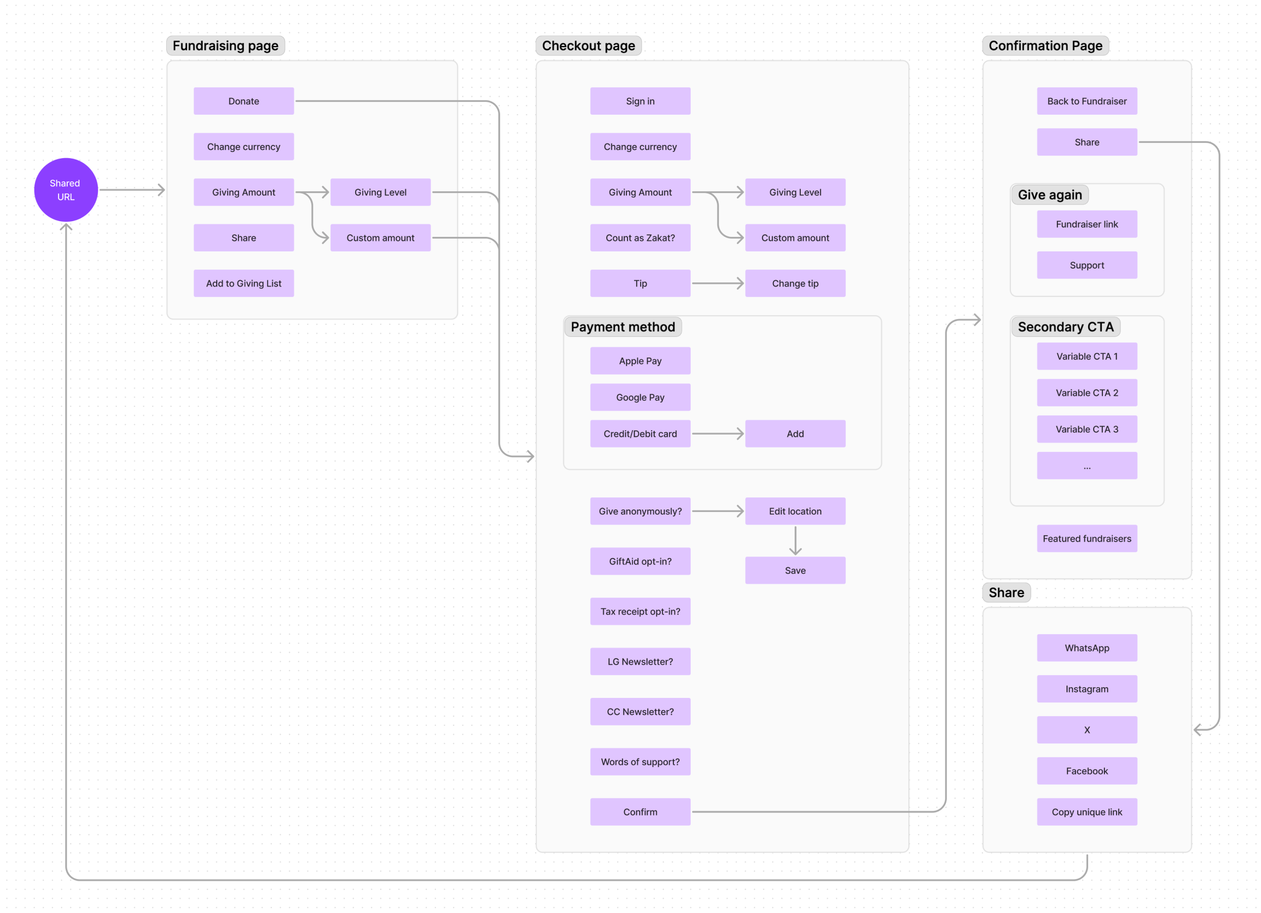
We mapped out, at a high level, the various interaction points within the user flow.
The information hierarchy was re-examined, and content was re-organized.
A simplified color palette and a refined type scale helped reinforce visual hierarchy.
Micro-interactions and animations were included, to draw further attention to specific elements, and to add delight to the experience.
Flows & concepts
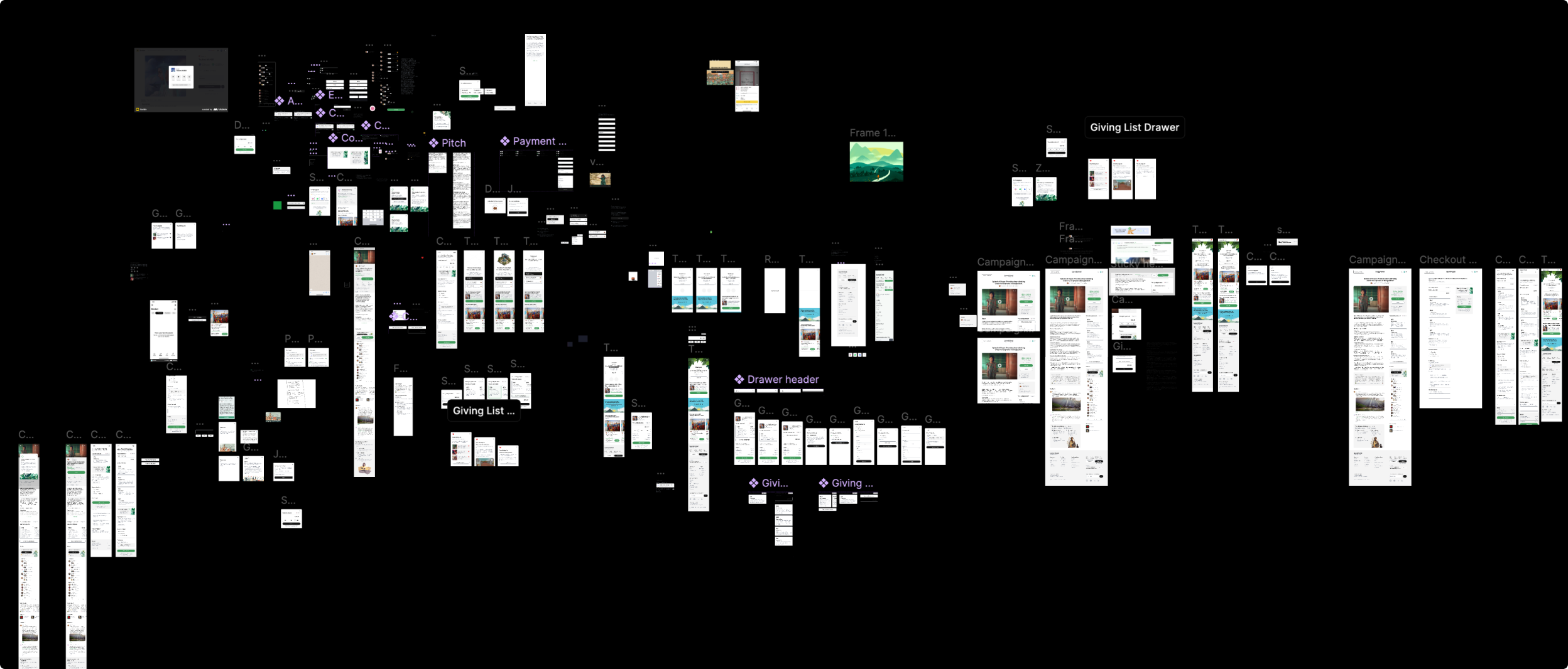
High fidelity conceptualization and prototyping
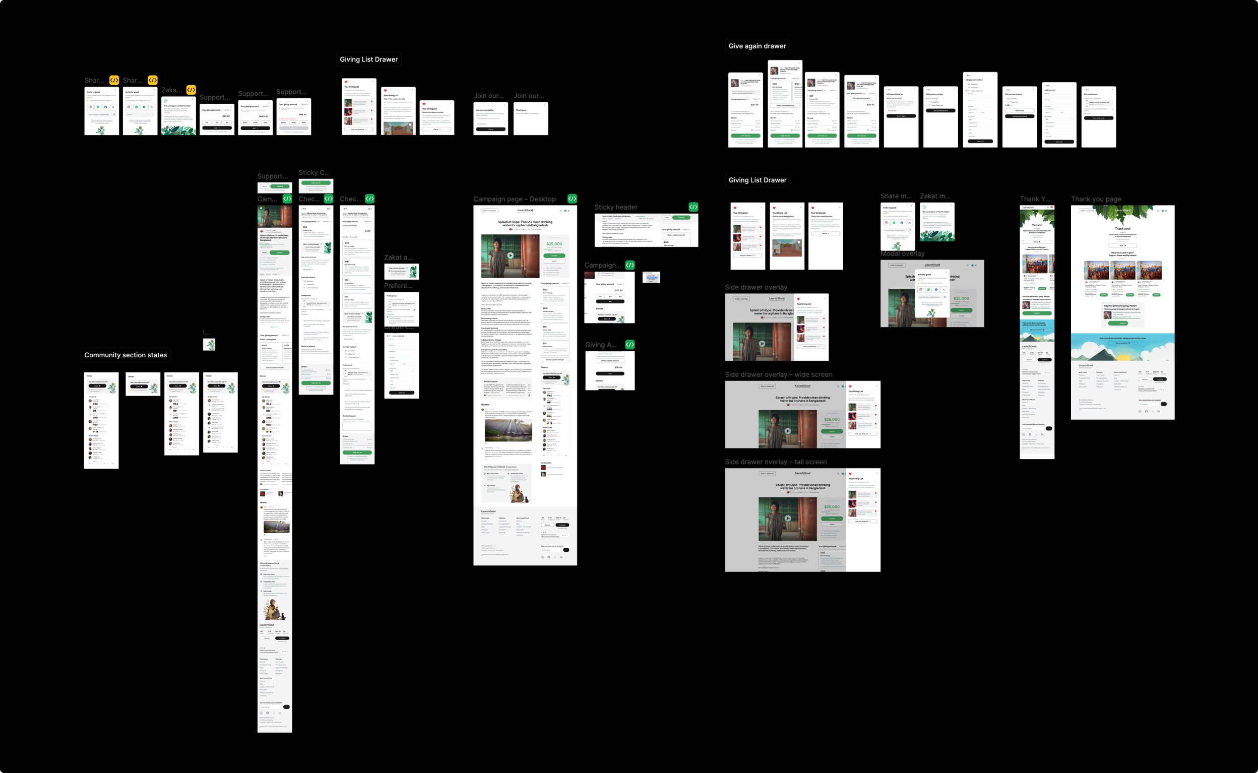
Screens and states ready for development
interface
Emphasis was placed on simplicity and clarity of information. Visual hierarchy was carefully considered to make the right information visible at the right time, in the right places.
Type scales, iconography, illustration styles, color palettes, interaction patterns, and more — all of these were re-evaluated or re-designed from the ground up. We referenced Tailwind CSS to streamline some decision making and implement some changes more easily and consistently.
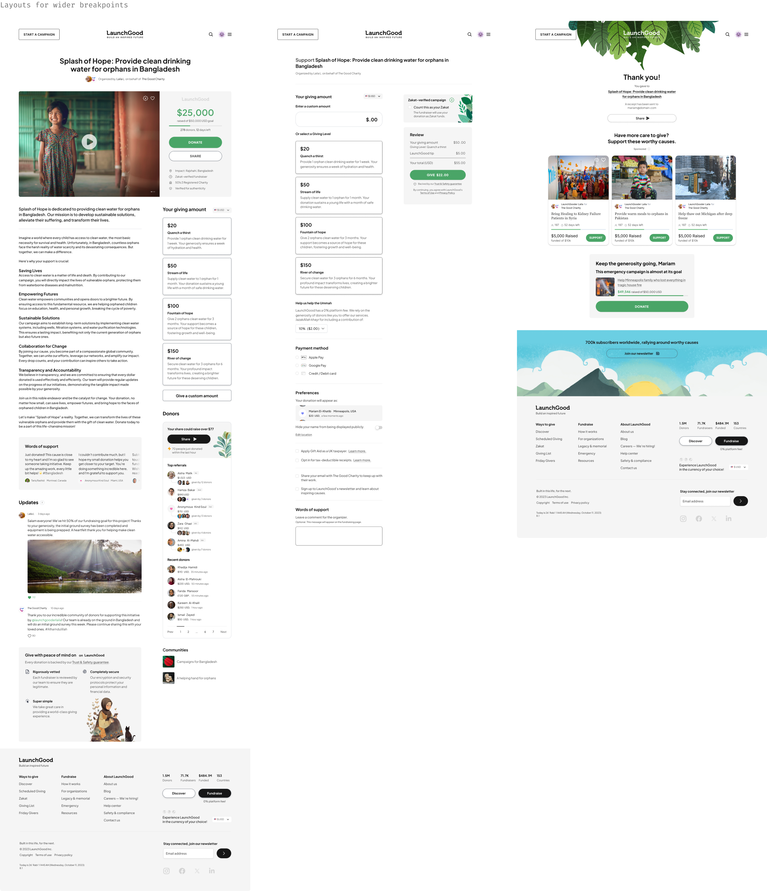
With the majority of users accessing LaunchGood through a mobile device, we have a policy of designing mobile-first. That said, we kept the design responsive and considered how the interface would adapt to wider screens.
Below are some specific elements worth highlighting between the original and redesigned screens.
Simply intuitive
The user interface was crafted with a lot of care and attention to detail. Since this project was initially intended to visually communicate a new platform-wide visual design, many decisions that were made here would go on to form the foundations of LaunchGood’s new Design System, Heart & Soul.

We did a soft launch of the new experience, with only a portion of traffic being directed to it through a specific are of the platform. Results were promising and so decided to direct a higher percentage of traffic to it.
Feedback was overwhelmingly positive from both donors and fundraising organizers. Below are some comments shared by organizers with our Business Development team following our launch.
launch and feedback
Not all launches are smooth. We did have a few unexpected bugs and other issues that the team resolved as quickly as they could.
Some features of the new experience were not possible to release until further backend work was completed — for example, the “Words of Support” feature. When we did release it, over 25,000 uplifting and inspiring comments had been left by donors within the span of 4 weeks (or about 900 per day!).
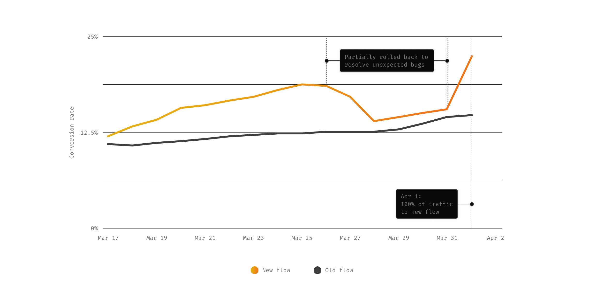
Conversion rate of new vs. old experience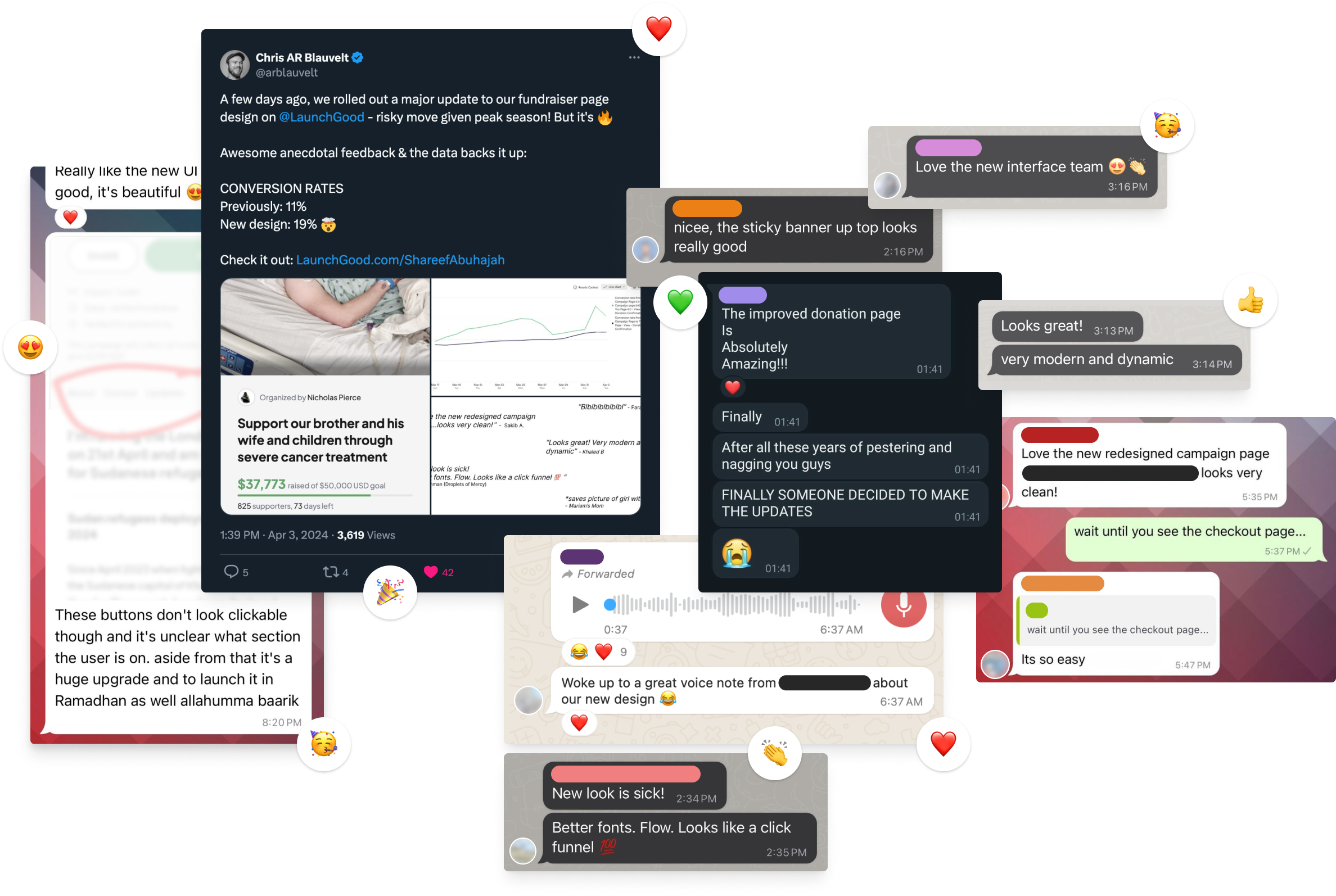
“ Absolutely fantastic!”
Feedback from a charity partner.